
Most product teams live in a messy middle ground. You want the bespoke feel of a dedicated illustrator-where the line weights on your 404 page match the iconography in your newsletter-but you lack the budget or timeline to commission custom assets for every single touchpoint.

The usual alternative is generic stock art. But that creates a new problem: visual incoherence.
That leads to a practical question about modern design resources: Can off-the-shelf libraries like Ouch support a real brand system, or is custom work the only way to avoid looking generic?
Ouch, a vector and 3D illustration library by Icons8, tries to solve this by focusing on comprehensive “styles” rather than standalone images. After using the platform for projects ranging from dashboard UI to marketing decks, the utility is clear. It’s not just about finding a pretty picture. It’s about adopting a visual language that scales.
The Architecture of Consistency
Stock sites usually suffer from the “Frankenstein effect.” You grab a flat vector for your homepage and a slightly different outline style for your contact page. The result looks stitched together.
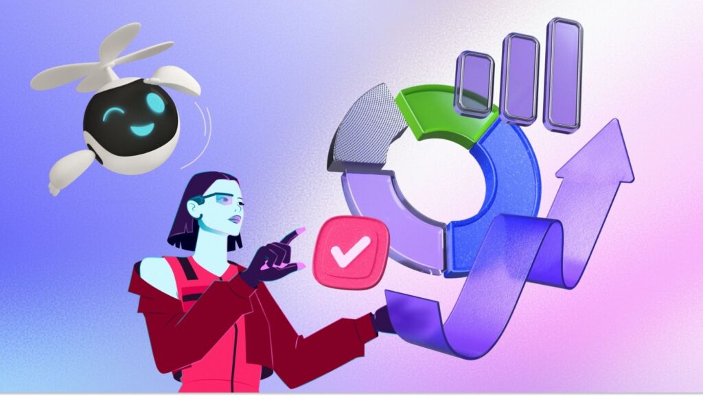
Ouch works differently. It organizes 101+ illustration styles into coherent families. Choose a style like “Surrealism” or “Business 3D,” and you aren’t getting five or six images. You access a library of thousands of assets drawn by the same hand, using the same palette and constraints.
Designers can treat the library like a design system. Pull assets for a checkout flow, a success state, and a marketing email. They will actually look like they belong to the same brand.
Scenario 1: The SaaS Product Designer
You are polishing a B2B dashboard. The wireframes are solid, but the empty states-those moments when a user has no data, no messages, or hits an error-look bleak.
In a typical Ouch workflow, you identify a style that matches the product’s typography. Let’s say you choose a minimal, geometric vector style to match a clean sans-serif font. You need specific metaphors: a “ghost” town for zero data, a broken robot for server errors, and a celebration scene for a completed setup.
Instead of drawing these from scratch, search within that specific style. You find the assets, but the default colors are yellow and black. Your app is teal.
Use the built-in recoloring tools. Or, if you need more control, download the SVGs (on paid plans) and map the vector paths to your product’s hex codes.
Export these as SVG or high-res PNGs. Because Ouch covers standard UX flows, you find specific variations for “add to cart” or “login” without hacking together a metaphor from a generic business meeting image. The result is a UI that looks proprietary, achieved in hours rather than weeks.
Scenario 2: The Content Marketing Sprint
A marketing manager at a startup needs to launch a blog series about remote work technology. The requirements: header images for twelve articles and accompanying graphics for social media promotion.
Fragmented stock sites turn this into a nightmare of searching for images that don’t clash. With Ouch, the marketer selects a “Technology” or “Web Elements” style. They locate scenes depicting video calls, server maintenance, and coding.
For a specific article about recruitment, the needs might be very literal. If you are designing a career portal and need specific job clipart, the library filters specifically for employment-related imagery within your chosen aesthetic.
Since the manager isn’t a vector artist, they use the Mega Creator integration. This tool lets them take a character from one illustration and drop it into a background from another, provided they are in compatible styles. They assemble a unique composition where a character sits on a giant stylized laptop.
Export the final composition. Move to the next article. The blog maintains a consistent visual identity, which increases the perception of brand quality.
A Narrative: The Solo Developer’s Workflow
Javi is a full-stack developer building a landing page for his new time-tracking app. He has no budget for a designer. He wants a 3D aesthetic to make the site feel modern and tactile, distinct from the flat design of his competitors.
He opens the Ouch library and filters by “3D Styles.” A pack called “Business 3D” catches his eye with its soft lighting and rounded shapes.
Hero Section
Javi needs a strong visual for the top of the page. He finds a 3D render of a person interacting with a floating clock. The default blue color clashes with his purple branding. A quick trip to the on-site recolor tool shifts the accent colors to purple before downloading.
Features Grid
He needs smaller spot illustrations. Staying in the “Business 3D” pack, he finds a calendar, a shield (for security), and a rocket. Because they share the same lighting model and texture, the features section looks cohesive.
Animation
He notices the library offers animated formats for some assets. He downloads a Lottie JSON file of a spinning hourglass to use as a loading spinner. It’s lightweight and matches the static 3D renders perfectly.
Implementation
He downloads the PNGs for the static images to keep page load speed fast. Since he’s on the free tier, he adds a link to Icons8 in the footer.
Javi ships a site that looks like it had a dedicated 3D artist, entirely by using the consistency of a single style pack.
Comparison with Alternatives
Ouch vs. Undraw
Undraw is the standard for free, open-source illustrations. It works well for zero-budget projects, but it suffers from ubiquity. Everyone uses it. A site built with Undraw looks like a template. Ouch offers significantly more stylistic variety, allowing for better brand differentiation.
Ouch vs. Freepik
Freepik has volume on its side, with millions of assets. But consistency is a nightmare. You might find a great server icon, but you will never find a matching user profile icon by the same artist. Ouch prioritizes the “pack” concept. Pick a style, and you have coverage for the entire user experience.
Ouch vs. Custom Illustration
Custom work remains the gold standard. It is unique to your brand and handles complex, specific metaphors. But it is slow and expensive. Ouch is the middle ground. It isn’t exclusive to you, but with recoloring and composition edits, it gets 80% of the way to a custom look for 1% of the cost.
Limitations and When to Avoid
Ouch is powerful, but it isn’t a magic bullet for every scenario.
● Print-on-Demand Merch: If your business model involves putting these illustrations on t-shirts or mugs for sale, the standard license won’t cover you. Contact them for specific merchandise licensing.
● Hyper-Specific Metaphors: You won’t find a visual of “a badger fixing a quantum computer.” The library covers broad categories like Business, Education, and Tech deeply, but niche surrealism still requires a human illustrator.
● Vector Editing: The free tier provides PNGs. To manipulate the Bezier curves of the vector paths yourself in Illustrator, you must upgrade to a paid plan to unlock SVG formats.
Practical Tips for Great Results
Don’t Settle for Defaults
The easiest way to spot a stock illustration is the color palette. Ouch’s recoloring tool is powerful. Always shift the primary colors to match your brand’s hex codes. It takes seconds but claims ownership of the visual.

Use the Pichon App
Mac and Windows users should download the Pichon companion app. It keeps the entire library offline and searchable. Drag and drop an illustration directly from the app into Figma, Photoshop, or VS Code. This saves the friction of downloading, unzipping, and importing files.
Mix Formats Carefully
Ouch offers 3D (FBX), animated (Lottie/Rive), and static vectors. Avoid mixing 3D renders with flat line art on the same screen unless you have a very deliberate art direction. Stick to one “dimension” per project to maintain professional polish.
Layering with Mega Creator
If a scene feels too generic, open it in Mega Creator. Delete a background element. Swap a character’s prop (change a phone to a tablet). Small tweaks make a common illustration feel tailored to your specific copy.
Ouch answers the central question of brand consistency. By prioritizing deep, stylistic packs over a scattershot of individual images, it lets teams build coherent visual systems that look intentional, professional, and surprisingly custom.